

CASE STUDY
UX & UI strategy that delivered:
🚀 30% faster launch with fewer QA issues
🎯 Stronger client buy-in with real user data
☎️ 20% more calls booked by turning user research into business wins


The Opportunities
We launched a 0→1 app, and stakeholder data showed how to prove its value and stand out in the market:
📊 Users wanted clearer proof of product benefits
👩🏫 Coaches asked for tools to guide goal-driven conversations
💼 Clients needed insights to support growth and retention
These points led to the Goals & Tasks feature: a tool for coaching sessions, and a source of insight for our partners.

The Challenges
📱 Mobile system was ready, but web had no foundation
🧩 Component library needed intentional growth (despite shiny competitor ideas)
⏱️ Building fast for clients while gathering quick user insights for adoption

The Scope
🎨 Role: Lead Product Designer
⏳ Timeline: 3 weeks
🤝 Team: PMs, Dev, Marketing, Design
📦 What I Shipped: personas, flows, components, prototypes, handoff
🔑 Focus: user insights, branding, scalable system
The Discovery Phase

Our clients needed data to justify their investment, and we needed user research quickly to decide on initial features. Here’s the strategy:
Explored competitive designs and smart patterns we could adapt without breaking our design system.
Leveraged internal networks for user interviews and surfaced early pain points to guide proto-personas.
Merged research and stakeholder input to define a primary persona to shape the early feature flow.
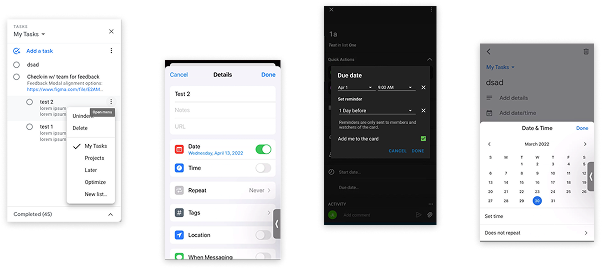
Competitive Research
To ground the feature in real-world expectations (our design system), I researched how similar tools framed familiar usage patterns:
guided onboarding and goal management
structured interaction timelines
dependencies, due date reminders, and calendar flows
Spectrum Mapping & Proto-personas
I then designed interviews to explore how people manage tasks, goals, and tracking, and mapped their behavior on a spectrum...

....and grouped patterns into proto-personas to spotlight the features that mattered most.
Primary Persona & Information Architecture
I combined interview insights, competitive analysis, and input from PMs, coaching teams, and VPs to refine a primary persona and map an initial user flow and prioritize key features needed for launch.

The Buildup to Launch
Using the research, proto-personas, and competitive analysis, I kicked off the design process by:
Collaboratively refining designs through a staged fidelity process
Creating user flows and interactive prototypes to guide specs and speed up handoff
Flipping our usual flow by designing mobile first, then adapting for desktop
Lo to Mid-Fi Wireframes
Ideation that doesn’t bloat the system: I sketched early ideas with our existing components in mind, avoiding cool-but-costly additions and focusing on what could ship fast.

Getting aligned early on: This overview gave the team a sense of the big picture and helped spot gaps before specs dropped, covering flow points like animations, confirmations, and a sense of a completeness.
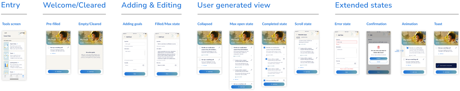
Feature Overview
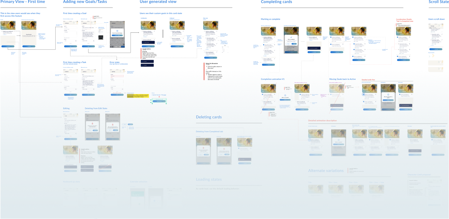
Prototyping the User Flow
Now, for the deeper dive: This prototype mapped detailed user states like editing, deleting, loading, errors, and character limits, so we could test the full experience before build and catch edge cases early.
Handoff Build Details
Dev Mode helps, but specs still matter: I documented key details like component dimensions, system alignment, and responsive behavior across iOS and Android to keep the build tight and consistent.

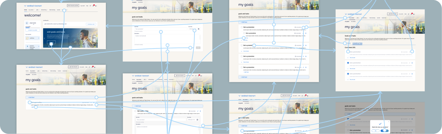
Peek at the Desktop View
The desktop system was limited, so let’s flip the usual process: I used the mobile flow I built as the base and adjusted just enough to make it work across platforms.
The Main Takeaways
V1 ≠ Final: Stick to the design system and let gaps reveal themselves.
Use what you’ve got. Early feedback and testing will tell you what truly needs to be customized.
Feeling stuck? Research is your shortcut.
Even scrappy research or competitor scans can unblock your flow and help shape smarter ideas.
Launch isn’t the end, building adoption into the product is part of the process.
Pair your feature with onboarding moments and marketing touchpoints. I used these assets to drive engagement:

The Key Impacts
30% faster launch with fewer QA issues.
Overlapping the spec process across mobile and desktop helped streamline dev handoff and became a go-to model for future features.
Increased client buy-in with real, qualitative insights.
Goals data gave sales something real to show, letting clients connect employee outcomes to product value.
Users who engaged with Goals were 20% more likely to book a call. A default “Set up a coaching call” prompt (my design-led strategy to highlight value early), paired with coach training to reinforce it, was driving users to real action... and FullStory confirmed it was working.
Browse the next or previous case study for more insights, or let’s connect.